
As the BI platform architect, you have to deliver an executive dashboard that can render 500,000 data points in real time, has built-in drill-down interaction with support for twelve different chart types, and will be deployed to production within 90 days.
If you choose the wrong JavaScript charting library, you’ll likely spend the next three months fighting performance issues, integration challenges, and long waits for support. All the while, your company’s competitors will roll out great-looking dashboards that render in under two seconds.
Typically, BI teams spend many weeks reviewing the different chart libraries, and then they end up choosing a library based on their feature list: “Supports 50+ charts” versus “GPU accelerated.” They have no idea how their choices will impact their project’s overall performance, customization options, and overall cost.
We have chosen five chart libraries that are production-ready and tested each one according to the following criteria:
- How the charts render and interact with live data in real-time
- How the charting libraries are integrated with different frameworks
- What charts are available, and how deep are the customization options?
- How the chart libraries behave in a production environment
- How easy are you to get the library to be accessible for all?
Here is a comparison of the top 5 JavaScript charting libraries.
Key Features to Look for in BI Charting Libraries
But before you choose a library for a large dataset, check what you have vs. what the company can actually do.
- Real-time performance, Can it show your dataset? (100,000 data points?) What are the frame rates on the company benchmarks?
- What chart types are included? Do you have a heatmap? A candlestick chart? Gantt?
- Framework Compatibility, What version of React, Angular, Vue are they supporting? How good are the types for these frameworks?
- Is this charting library production-ready? (How long does it take you to support? What is your support? What is the community response time? How frequently are bugs being fixed?)
- Does this charting library follow web standards? (Is it accessible?) (Screen reader support? Keyboard navigation? A high-contrast mode?)
- Is the charting library mobile-friendly? Do the charts support mobile? Is there a different implementation of this?
How We Evaluated the Best JavaScript Chart Libraries
Our ranking of the five libraries was based on real-world business requirements rather than hypothetical scenarios.
We looked for libraries that could deliver live, real-time updates on data-rich dashboards, had a broad range of chart types with robust customization options, and integrated seamlessly with the latest versions of major frontend frameworks (React, Angular, Vue).
We also valued production-grade support and reliability, including clearly documented support levels, and accessibility features included from the outset, so they wouldn’t require manual work from developers.
In addition to the profile data we were provided, which included company positioning, years founded, feature sets, and cost signals, our analysis also included publicly available testing and benchmark results, as well as an examination of how various BI solutions interact with the other tools in the data ecosystem.
Quick Comparison
Scan this table to match your BI platform’s performance requirements and customization needs against each library’s core strengths.
| Firm | Chart Types & Specialization | Performance (Data Points) | Rendering Engine | Best For | Learning Curve |
| SciChart | Financial, scientific, real-time streaming | 100M+ at 60 FPS | GPU-accelerated WebGL/Canvas | High-frequency trading dashboards | Moderate |
| amCharts | 60+ types, Gantt, financial | Millions with Canvas optimization | Canvas + SVG hybrid | Enterprise BI with accessibility | Low |
| Fusioncharts | 95+ charts, 1400+ maps | Thousands optimized | SVG | Rapid deployment, multi-framework | Low |
| Highcharts | Modular: Stock, Maps, Gantt | Hundreds of thousands | SVG | Mission-critical production dashboards | Moderate |
| D3 by Observable | Unlimited custom visualizations | Depends on implementation | SVG, Canvas, WebGL | Bespoke graphics, data journalism | Steep |
Top 5 JavaScript Chart Libraries For Business Intelligence
BI dashboards push charting libraries to their limits—large data volumes, constant updates, and no tolerance for lag. Here are five libraries that can handle the load, starting with the fastest of the bunch.
amCharts
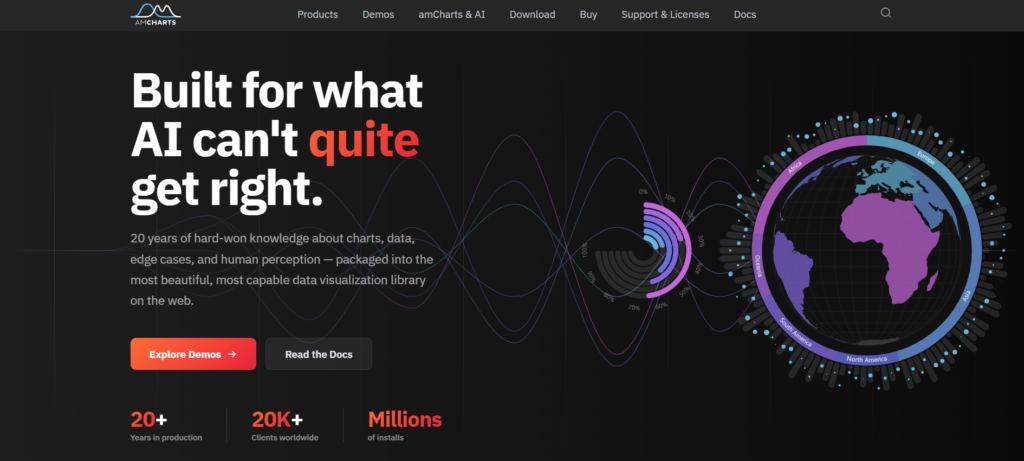
amCharts was introduced in 2006. They possess 20 years of experience in the field of data visualization. They offer over 60 chart types, including financial charts and Gantt charts. This covers various uses, from real-time dashboards to complex project tracking.
They use Canvas rendering. It outperforms SVG, which is ideal when dealing with large volumes of data. This is vital in business intelligence applications when updating multiple charts without browser lag. It is worth mentioning that amCharts is used by over 20,000 companies globally, establishing a level of credibility that is essential in choosing a technology to support long-term business needs.
Their emphasis on accessibility and visual perception is fundamental to their design. They provide a range of color schemes suitable for users with visual impairments, animation techniques that consider visual processing limits, and built-in compatibility with screen readers.
For BI professionals managing executive dashboards that must adhere to compliance standards, this integrated accessibility significantly reduces the time spent on remediation. The use of Canvas also allows for smoother animations and quicker initial page loads compared to solutions relying on DOM manipulation.
Pros:
- With over 60 chart types readily available for deployment, amCharts allows organizations to eliminate most custom charting projects.
- amCharts’ Canvas-based rendering is more performant for high-volume data.
- Accessibility is an integrated functionality of the product, not an add-on.
Cons:
- amCharts’ pricing requires a sales call; there are no publicly available tiers.
- If you’ve never worked with the Canvas API, AmCharts’ learning curve is higher than that of other libraries.
- The one thing that could go wrong with amCharts:
- They don’t offer a free tier or sandboxed environment to trial the product before you buy.
SciChart
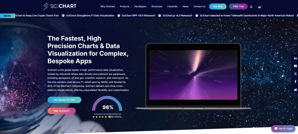
In 2012, SciChart was established with a mission to solve one of the hardest problems in browser-based data visualization: rendering hundreds of millions of datapoints in real time without sacrificing responsiveness. Its proprietary Vx™ GPU-accelerated rendering engine shifts intensive processing to the GPU, allowing applications to maintain smooth performance even under heavy streaming workloads.
Beyond performance, SciChart offers one of the most comprehensive visualization toolsets on the market, including 2D and 3D charts, heatmaps, polar charts, gauges, and geo-maps. Developers also benefit from a highly customizable API with extensive configuration options for building tailored dashboards and analytics applications.
The platform supports JavaScript, React, WPF, iOS, and Android, helping teams deliver a consistent experience across web and native applications. SciChart has earned a strong reputation among developers, with nearly 500 five-star reviews on Reviews.io, extensive documentation, more than 170 examples and demos, and a built-in AI assistant integrated throughout its documentation to help accelerate development.
Highlights:
- GPU-accelerated rendering capable of handling hundreds of millions of datapoints
- Real-time streaming and low-latency updates
- 2D, 3D, Geo Maps, Gauges, Polar Charts, and Heatmaps
- Highly customizable API with extensive developer controls
- More than 170 examples and demos
- Built-in AI assistant integrated throughout the documentation
- Nearly 500 five-star reviews on Reviews.io
- WPF, JavaScript, React, iOS, and Android support
- Native React integrations
Fusioncharts
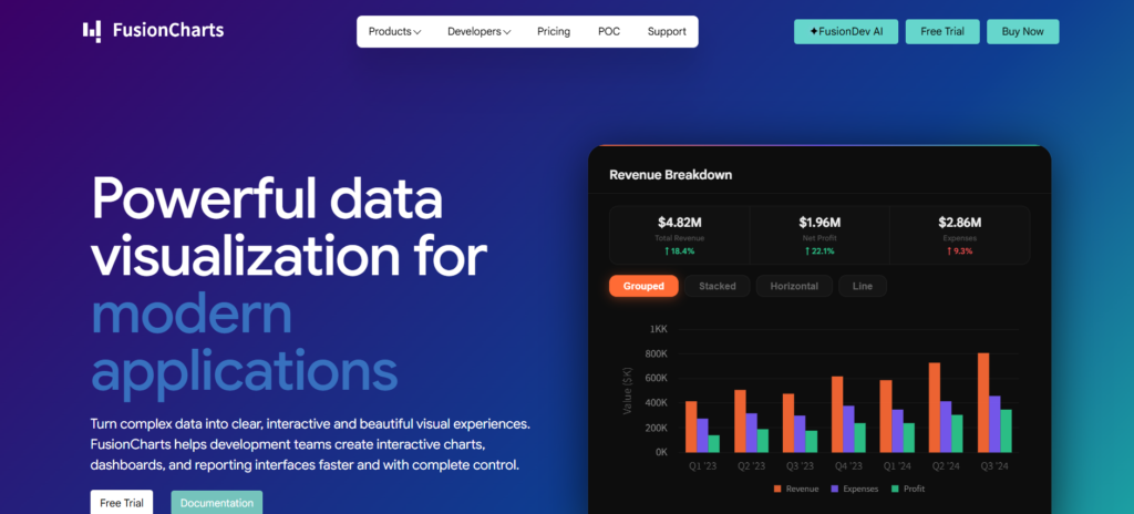
Rather than a charting library, Fusioncharts acts more as a visualization engine, offering 95+ chart types and 1400+ maps for full BI coverage. This diversity comes in handy when your charts might need to switch between funnel, heatmap, and bullet charts without pulling in more modules or dealing with differing API standards.
Fusioncharts has a number of more than 20 ready-to-go dashboard templates, which is great for teams working on multi-tenant apps because they can easily take any of the templates, say a financial KPI one, and make their own customized version to fit their own needs. You can take that template, plug in any data source, and deploy your first BI-ready dashboard in a few hours.
FusionCharts has built-in support for both Angular and React, so you don’t have to deal with a 3rd-party library, and its responsive design allows for charts that can be viewed on web, mobile, desktop, and tablet. This means that your charts will look and behave the same across these devices, making it much easier to deliver BI content on all devices at once.
If your team is working on an enterprise application that requires different types of charts to meet the needs of different user types, FusionCharts makes it super easy to do that. There’s also no need to think about whether FusionCharts will meet your team’s requirements or not, as their 95+ supported chart types cover many use cases that most of its competitors will not. These include edge cases like Pareto charts, Marimekko charts, and drag-and-drop diagrams.
FusionCharts can also reduce the time from start to first visualization by between 60 to 80 percent, and because it has built-in Angular and React components, it is much faster than using generic wrapper libraries. Furthermore, the responsive design of FusionCharts ensures it maintains consistency and layout across screen sizes from 4K monitors down to smartphones.
Highcharts
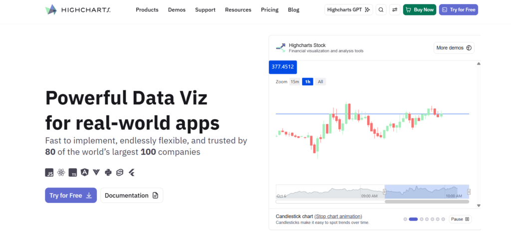
The Highcharts engine is divided into six functional modules: Core, Stock, Maps, Gantt, Grid, and Dashboards, which allows Business Intelligence teams to import and use only specific modules for optimal efficiency and a small library footprint. In effect, you can avoid having to load the entire library when a business intelligence dashboard needs only time-series and geographic information.
The library is built to work natively with React, Angular, and Vue, and the documentation focuses heavily on demonstrating usage in real life, rather than simply providing an API reference guide. There is also a strong commitment to accessibility and developer support, resulting in chart elements that are ARIA-compliant, easily navigable by keyboard, and readable by screen readers.
It has been demonstrated in Business Intelligence and financial dashboards, making it able to manage more advanced business intelligence needs. These include scenarios like sparse data, uneven time periods, and mixed charts, which would be impossible with other, more basic charting libraries. There is also an online community and forum, where people are likely to receive a response from the developers and not just a link to documentation from the community.
Weakness in one line: Price information is not available; it is possible to receive a quote only for enterprise solutions, which can delay your proof of concept when you are building the budget.
D3 by Observable
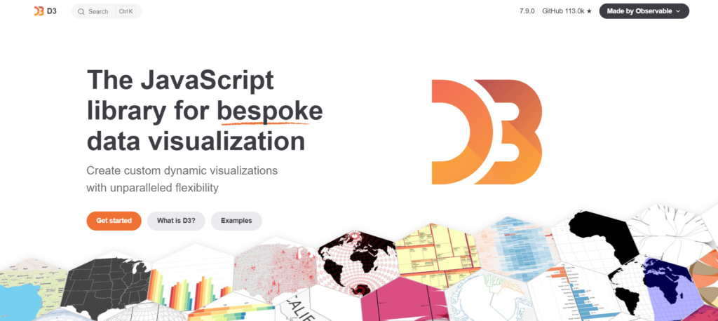
Launched in 2011, D3.js has grown into the most ubiquitous library for building data-driven web visualizations, but it’s a library for doing things yourself, not selecting a visual from a list of pre-bundled charts (like the ones listed above).
Rather than pulling the charts of your choice from an ever-changing catalog, it gives you complete access to data-driven DOM, SVG, and Canvas rendering. As a result, D3 is the only library that enables you to compose visual data from its primitives, bind and transform data as well as control and manipulate the DOM itself.
As it’s built on data-driven visual elements (rather than pre-made chart components), D3 can be used to create just about any type of data visualization you can imagine. And as more people are using D3.js, the more they’re building increasingly sophisticated charts on top of it. For example, you can nest treemaps in D3.js and interact with them in interesting and unexpected ways. D3.js is also able to render and animate SVG data visualization with ease.
So if your BI dashboard is going to be the most data-driven visualization of your entire business, and the most complex and unique, you should absolutely use D3.js. And if you want to animate your way from a bar chart to a pie chart, you can do that with ease in D3.js.
However, D3 requires more code to build these visualizations. In other words, you’ll get more customization and more control if you use D3, but you will spend more of your time writing the code. D3 has more than a dozen transition methods that can be used to animate any transition, and you’ll need to master them in order to get a smooth animation. And if you’re looking to add interactivity to your D3 chart, D3’s event handling will need to be implemented in your code.
D3 is the most popular tool for building bespoke data visualizations because there are countless production-quality, unique visualization dashboards in the wild, built with this tool.
Pros:
- You’ll have almost infinite flexibility in D3, so you can build the visualization you’re dreaming of
- Open source and no licensing fees to D3 (although there could be hosting costs)
- Large, active community means plenty of tutorials, examples, demos, plugins, and more
Cons:
- No performance testing has been performed on large datasets
- D3 requires expertise in JavaScript and SVG
Best use: When a company has a uniquely custom requirement or simply has the resources in-house to build a truly unique visual that’s unlike other BI dashboards.
Conclusion
BI teams often spend too many weeks weighing libraries in terms of their capabilities, only to run into performance issues or struggle with integration.
Each of the five charts above solves the balance between speed, customization, and deployment time in a different way, so there are tradeoffs to consider when you’re weighing them:
- GPU-based engines for visualizing millions of streaming data points
- renderers based on Canvas for providing a good selection of charting options in a reasonable timeframe
- modular packages for getting dashboards up quickly
- lower-level packages that provide more control when your visualizations have to be totally bespoke
The best way to pick a charting library is to start with your biggest dataset, see how it performs in a trial, and see how it integrates with other frameworks. You can test out performance issues and time to first visual in this environment, and you’ll quickly find out the one that doesn’t quite work for you.