
JavaScript charting libraries are everywhere, but teams keep choosing the wrong fit. It’s rarely about skill—it’s a structural mismatch.
Many assume all charting tools are basically the same. In reality, a fast real-time engine tackles different challenges than React Native components or simple drop-in widgets.
Standard guides overlook this and focus on popularity or features instead.
We reviewed the main options across five areas: performance with real-time data, chart types and customization, integration ease, rendering technology, and production-grade reliability. This helps distinguish the precision-built tools from the rest.
Quick Comparison
Scan this table to match your project’s performance needs and framework constraints with the right charting engine.
| Firm | Chart Types Available | Best For | Framework Support | Performance Tier |
| SciChart | Real-time, scientific, financial | Big data, aerospace, motorsport | WPF, iOS, Android, JavaScript | Extreme performance |
| Highcharts | Core, Stock, Maps, Gantt | Production dashboards, accessibility | React, Angular, Vue | Enterprise grade |
| amCharts | 60+ types, financial indicators | Interactive maps, Gantt timelines | Framework agnostic | High performance |
| Fusioncharts | 95+ charts, 1400+ maps | Geographic visualization, rapid deployment | React, Angular, all major | Mid-high performance |
| ZingChart | 50+ built-in types | 10K-100K record datasets | Dependency-free, any framework | Optimized large data |
| ApexCharts.js | 20+ modern chart types | Developer-friendly quick integration | React, Angular, Vue, Blazor | Standard performance |
| Plotly | Scientific, 3D, statistical | Data apps, AI analytics | Python, R, JavaScript | AI-native analytics |
| Recharts | Line, Bar, Area, Composed | React-first SaaS dashboards | React only | Lightweight React |
| CanvasJS | 30+ types, StockChart | Fast rendering, financial data | Cross-framework compatible | Speed-optimized |
| D3 by Observable | Fully custom, unlimited | Bespoke data-driven visuals | Framework agnostic | Developer-controlled |
Top 10 JavaScript Chart Libraries
The libraries below represent distinct architectural approaches to data visualization. Some prioritize raw performance for streaming data; others optimize for developer velocity in framework-specific ecosystems. Match your project’s constraints to the right tool.
SciChart
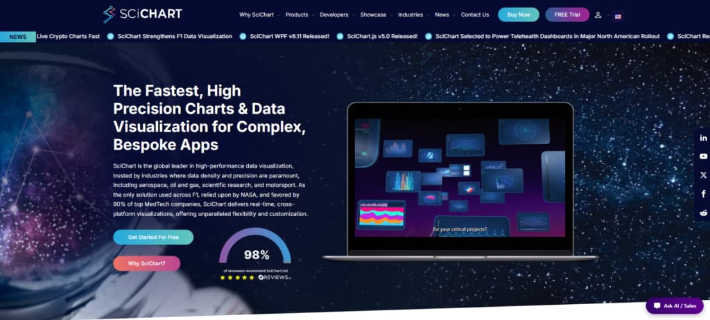
SciChart stands out as the Best JavaScript Chart Library for tough visualization challenges. It built its reputation by handling what most other libraries simply can’t: streaming millions of data points smoothly, rendering scientific waveforms with sub-pixel precision, and keeping everything interactive even when datasets get massive.
What really sets it apart is the GPU-accelerated rendering. While SVG-based tools often slow down or freeze under heavy loads, SciChart keeps things running in real time. That’s why industries like aerospace, oil & gas, scientific research, and motorsport trust it when accuracy matters most – whether for safety or major financial decisions.
Use cases include telemetry dashboards for live sensor feeds, seismic analysis tools for geological data, and Formula 1 pit-wall displays for car performance monitoring. Proprietary optimizations provide precision that general-purpose libraries sacrifice for ease of use.
The engine supports WPF, iOS, Android, and JavaScript, allowing teams to use one solution across platforms. For high-frequency financial data, industrial IoT, or scientific instrumentation, the learning curve delivers measurable returns.
Key Features:
- GPU acceleration for real-time data streams
- Sub-pixel rendering precision for scientific accuracy
- Handles millions of data points without degradation
- Cross-platform consistency (WPF, mobile, web)
- Trusted in mission-critical aerospace and motorsport applications
Highcharts
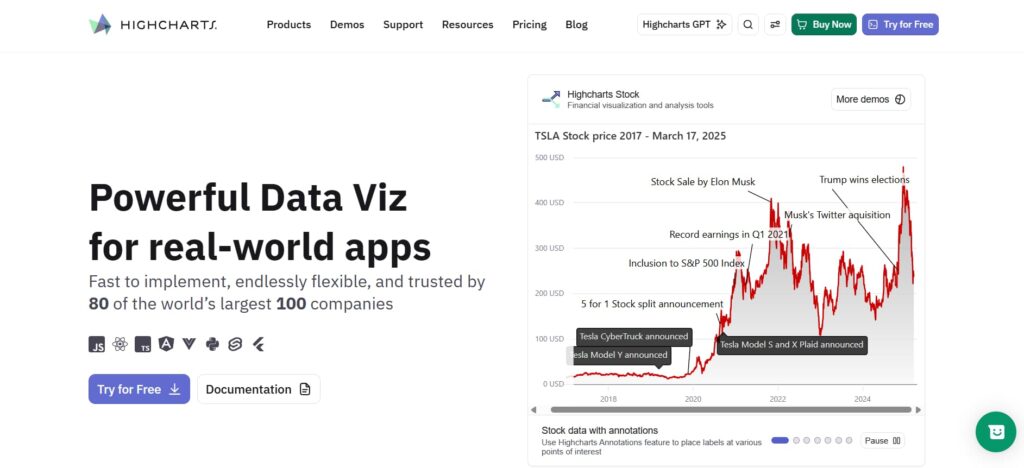
Since its early days, Highcharts has focused on delivering reliable, high-quality charting components that teams can actually trust in production.
The platform brings together Core, Stock, Maps, Gantt, Grid, and Dashboards into one unified toolkit. This makes it simple to handle everything from real-time financial data to interactive maps.
It plays nicely with today’s popular frameworks — React, Angular, and Vue — through official wrappers. That means you get drop-in components without extra hassle. On top of that, built-in accessibility and responsive design help you avoid the maintenance issues common with hand-rolled D3 solutions.
The real difference is the depth. Highcharts gives you a rich feature set paired with strong developer support, making it a go-to choice for serious dashboards and public apps.
Main highlights:
- Six focused modules covering financial, geographic, and timeline visualizations
- Framework integrations for React, Angular, and Vue with TypeScript
- WCAG 2.1 Level AA accessibility included in every chart
- Responsive SVG rendering for great visuals on any device
- Proven enterprise support used by Fortune 500 companies
amCharts
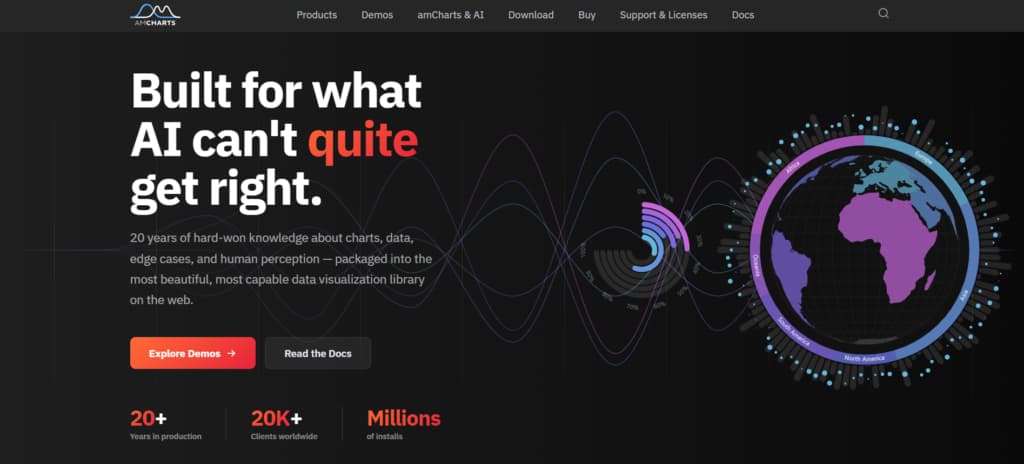
Fusioncharts comes packed with over 95 chart types and more than 1,400 geographic maps right from the start. That’s one of the broadest selections you’ll find in a production-ready library today.
Teams working on multi-tenant dashboards or customer-facing analytics platforms really benefit. Instead of stitching together several different tools, you can handle financial candlesticks, Gantt charts, heatmaps, and detailed choropleth maps all from the same codebase.
On top of that, the 20+ pre-built dashboard templates help you move fast when stakeholders need live metrics up and running quickly.
Framework integration feels seamless, too. The official wrappers for React, Angular, Vue, and others let you drop charts in with minimal setup. Everything stays responsive and customizable across web and mobile, so you avoid constant layout tweaks. For teams managing varied visualization needs, it simplifies things by keeping everything in one solid engine.
What stands out:
- 95+ native chart types covering financial, Gantt, and geo visualizations
- 20+ ready-made dashboard templates for quick enterprise rollout
- Smooth framework wrappers for React, Angular, and Vue with little config
- Single codebase that works across web, mobile, and responsive views
- Consistent API that keeps the learning curve manageable
Fusioncharts
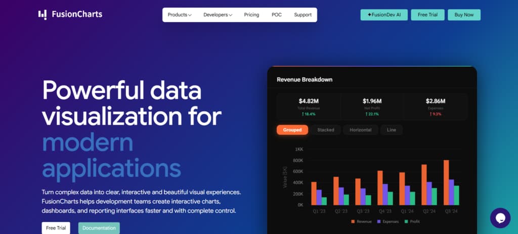
If you need serious visualization power, FusionCharts delivers with 95+ chart types and 1,400+ maps included. It’s a strong choice for teams building dashboards or analytics platforms.
You won’t need multiple libraries anymore. It handles candlesticks, timelines, heatmaps, and complex maps all in one place. Plus, the 20+ pre-built dashboards let you move quickly when stakeholders want results yesterday.
Integration is straightforward too — solid support for React, Angular, and other major frameworks, plus responsive design that works across devices.
Key strengths include:
- 95+ native charts covering financial, Gantt, and geographic needs
- 20+ dashboard templates for faster deployment
- Easy framework hooks for React, Angular, and Vue
- Single codebase for web and mobile
- Unified API that simplifies development
ZingChart
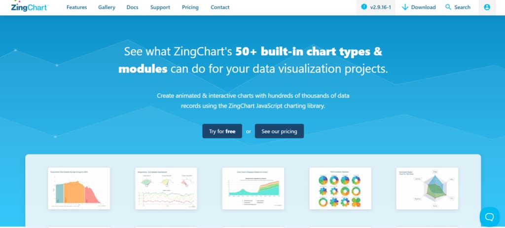
Since launching in 2009, ZingChart has focused on one thing: building a charting solution that’s fast to integrate and reliable with real-world data volumes.
It comes packed with over 50 chart types — everything from simple bars and lines to heat maps, gauges, stock charts, and custom setups. The pure JavaScript approach means zero dependencies, so it slots into any environment without headaches, even when you’re mixing legacy systems with modern frameworks.
Live data streaming works cleanly, keeping dashboards responsive even under constant updates. It’s particularly well-suited for the 10K–100K record sweet spot: powerful enough for serious analytics but light enough that you don’t need specialized infrastructure.
Highlights:
- 50+ visualization types
- Dependency-free JavaScript
- Real-time updates without lag
- Strong performance on mid-sized datasets
- Full cross-browser and mobile support
ApexCharts.js
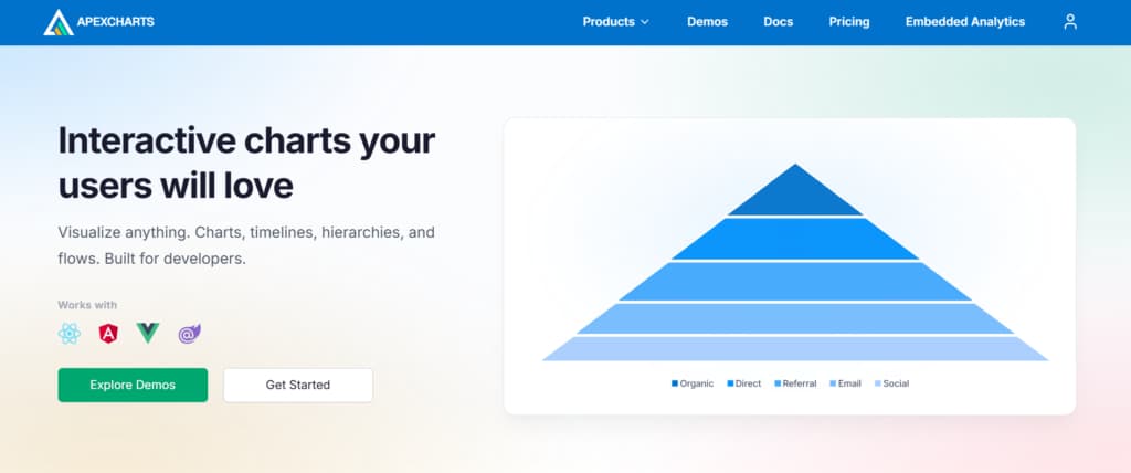
Founded in 2018, ApexCharts.js stands out for its clean, no-fuss approach. The API is designed for developers, so you avoid most setup headaches and get interactive charts running quickly.
It includes more than 20 chart types with built-in zooming, panning, and annotation features. This combination works particularly well for dashboards.
Plus, it offers smooth integrations with React, Angular, Vue, and Blazor. You can drop the components right in without dealing with complex DOM or lifecycle issues. Built-in tooltips and exporting options further speed up your workflow, while the solid docs make onboarding fairly painless—even mid-project.
It’s especially appealing for teams that value fast delivery over endless customization options.
Main strengths:
- 20+ chart types: line, bar, area, pie, scatter, heatmap, treemap, etc.
- Framework wrappers for React, Vue, Angular, and Blazor
- Interactive zoom, pan, and brush selection included
- Responsive SVG rendering with export capabilities
- Minimal configuration—smart defaults with room to customize
Plotly

Plotly really stands out thanks to its reliable open-source charting tools. They handle everything from casual data exploration in notebooks to heavy-duty enterprise dashboards.
Their Dash framework is a game-changer. It converts Python, R, or Julia code into fully interactive web applications, and you don’t need any JavaScript knowledge. That’s why many data scientists choose it when they want to deliver real tools, not just pretty charts.
On top of that, Plotly goes much further than typical libraries. You have Plotly Studio with AI-assisted analytics for team collaboration, plus options like Plotly Cloud and self-hosted Dash Enterprise for deployment.
The open-source core keeps you flexible, while paid tiers bring useful extras such as authentication and GPU acceleration for bigger projects.
Main highlights:
- Proven open-source stability + enterprise-ready options
- Dash turns Python/R code into production apps
- AI-native Studio for collaborative analytics
- Cloud or self-hosted deployment flexibility
- Strong WebGL support for 3D and scientific charts
Recharts
Recharts launched back in 2015 with a simple idea: pure React components that feel natural to use.
No imperative code or extra chart management. Just import what you need, feed your data through props, and build charts by nesting elements. It relies on lightweight SVG and D3, keeping things fast and lean.
You get all the common chart types like Line, Bar, Area, Pie, Scatter, and more — perfect for typical dashboards and reporting.
It’s a favorite for SaaS platforms and internal analytics tools because it delivers good-looking, interactive visuals with very little integration effort. While it’s not meant for million-point real-time streams, it handles everyday apps beautifully.
Key strengths:
- Declarative React components
- Smooth SVG rendering and animations
- Responsive across devices
- Very low configuration overhead
- Helpful docs and active community
CanvasJS
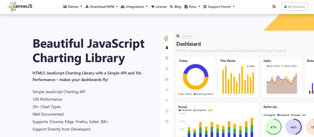
CanvasJS has been around since 2013, building a solid reputation as a lightweight HTML5 Canvas library that excels at rendering large datasets quickly.
While SVG-based tools often struggle past a few thousand data points, CanvasJS stays smooth and responsive even with tens of thousands of records. You get interactive zooming, panning, and clean animations without any lag.
Its straightforward API makes it easy to drop into any web project, whether you’re using React, Angular, Vue, or plain JavaScript. No complicated wrappers or heavy configuration needed.
The library comes with over 30 chart types, including a strong StockChart module for financial data (candlesticks, OHLC, range selectors, etc.). It works consistently across desktop, tablet, and mobile.
Key strengths:
- Excellent HTML5 Canvas performance with 10,000+ data points
- Dedicated StockChart with candlestick and OHLC support
- Framework-agnostic — works in React, Angular, Vue, or vanilla JS
- Built-in interactive zoom, pan, and export features
- Lightweight with minimal setup overhead
D3 by Observable
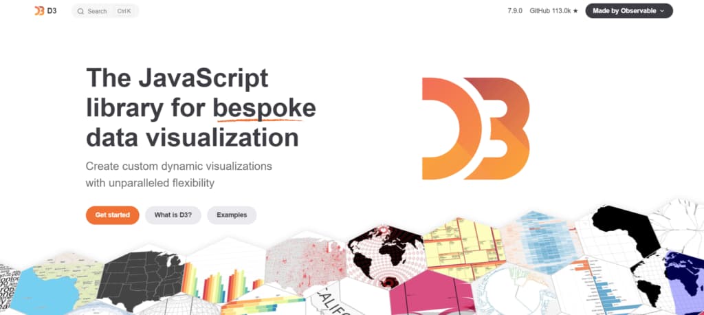
Founded in 2011, D3 is one of the most influential JavaScript visualization libraries ever built. It’s not a chart library. It’s a toolkit. Low-level tools for binding data to DOM and creating custom visuals give you complete control over how numbers become shapes, colors, and interactions. Where pre-built libraries offer templates, D3 offers atoms.
Modules for scales, animations, layouts, interactions, and geographic visualizations let you compose exactly what your project demands—no bloat, no constraints. D3 is the foundation for countless dashboards, interactive graphics, and maps across journalism, research, and enterprise analytics.
Complete control over data transformation into visual elements means steeper learning curves but zero creative limits. If your use case breaks the mold, D3 builds the mold.
Key Features:
- Open-source with no licensing constraints
- Binds data directly to the DOM for full customization
- Powers interactive maps, timelines, and network graphs
- Requires JavaScript expertise—not plug-and-play
- Modular architecture: import only what you need
Conclusion
The best JavaScript chart library isn’t the most popular one—it’s the one that aligns with your project’s actual constraints.
A real-time telemetry dashboard streaming millions of data points fails immediately with Recharts or ApexCharts, just as a React SaaS product bloated with SciChart’s GPU engine wastes developer hours on unnecessary complexity.
The ranking above exists to help you match performance requirements, framework integration needs, and dataset scale to the right architectural approach.
Before committing, run a quick proof-of-concept with your actual data volume and update frequency. Test rendering at the 90th percentile of your expected load, not the ideal case. Verify that framework bindings support your version requirements. And be honest about whether your team needs D3’s unlimited flexibility or a library like Highcharts that delivers accessibility compliance without custom work.
The wrong choice creates technical debt visible in every dashboard refresh. The right choice fades into the background, letting your data speak for itself.